InCorr Therapy + Coaching
Logo & Branding
Role: Lead Designer
Overview:
Incorr is a coaching group focused on trauma informed therapeutic methods. The client needed a visual brand identity that matched its calm and informed coaching practice. They needed a visual to match their inviting service. Incorr itself is focused on their more therapeutic approach, while their branch Incorr Coaching focuses more on the coaching side. In addition they wanted a visual for their course called SETI. This course was something they were building that informs other practitioners, expanding their network and way of healing others. A big goal of this project was to build a visual identity that can be expanded into their coaching realm and stay true throughout their whole ecosystem of services and their course.
After the initial meeting with the client, we decided on our target audience and they shared with me their vision and mission for their practice. We discussed their goals and I got to know more about who they are and how they portray themselves within their field.
The next step was to find references and begin to build a comprehensive mood board that brings a visual aspect to the words and concepts that we talked about in our discussions. The client and I decided the best way to do this was for them to share their Pinterest board with me. I also started my own board so that I could build off of theirs without disrupting their inspiration. This resulted in a fresh board of ideas, presented through patterns, photography, colors, and motion.


I then started sketching out some initial ideas based on our conversations.


Then I took those initial ideas to Adobe Illustrator and combined them with other inspiration that we had gathered. This helped me expand my ideas and try new things with different textures, patterns, and styles. I worked on creating a variety of options to present to the client.


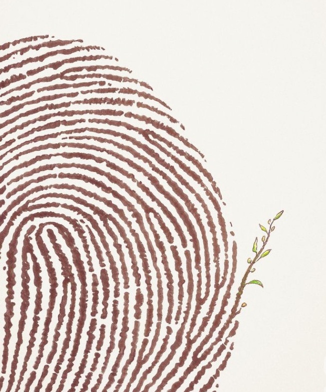
We decided on a specific style and narrowed down the type of pattern. The client was especially interested in the patterns of fingerprints and woodgrain. They also enjoyed the circular shape of the logo mark.

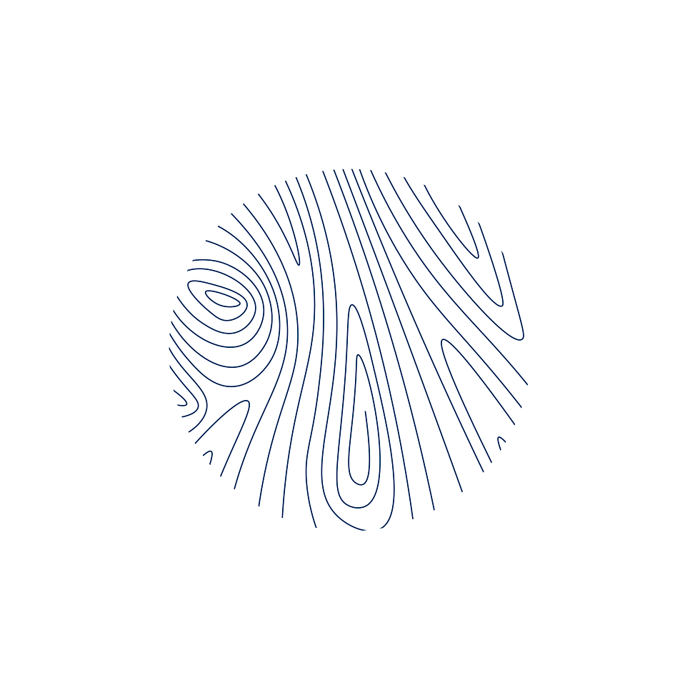


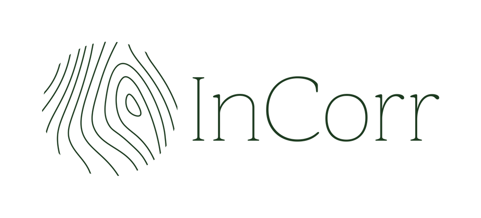
From here we were able to fine tune the pattern to balance wood grain and fingerprint while still keeping a clean look and feel. This resulted in our final logo that keeps a natural feel and calming presence while keeping its own identity. From here it was easier to choose the typography that matched the energy of the logo mark. I then build a color scheme based on the aesthetic that we explored together.


With Incorr brand finalized, it was time to expand the identity to accommodate more freedom and incorporate the coaching side as well and the SETI course.


I was then able to start utilizing the brand elements and create social media posts to be used across multiple platforms. Using the colors, typography and photography style, I built content that felt true to the client and their vision.


More Design Work
Here are some more projects I have been working on


Lina roesser tattoo
Website Design

artmill
website design

OXYGEN FOR TEAMS
BRANDING & WEBSITE DESIGN

Abstract Coffee
Branding

Leaf & Lark
branding
