The Regenescape
Logo & Branding
Role: Lead Designer
Overview:
The Regenescape is a content and media start-up built around regenerative practices. They encourage people that we shouldn't just sustain the world, but actively leave it better than we found it. They needed a brand identity that matched that ambition: one that could speak to multiple audiences, reflect a forward-thinking worldview, and be used independently by their team long after our engagement ended.
I started this project off with meeting with the co founders to hear their vision for the future. After an initial discussion, I engaged in market research in order to construct an idea of where this brand was compared to others and who might be interested in what they were doing. I lead the founders through an exercise to fine tune who their target audience is by creating User Personas that align with their brand vision. We solidified three different user personas who represented the audiences we wanted to engage.


Next, we worked on gathering a myriad of key words that we could reference at any point to make sure our vision was aligned.

With these things solidified, I was able to take this knowledge and build a mood board that suited each audience and then found a middle ground between them. I then combined different artworks, photography, vector designs, and curated references across photography, illustration, and motion to build an overview of the way we wanted the brand to feel. This mood board became a crucial starting point that helped move me from the brand guidelines to actually making designs of my own. It also became integral in justifying design decisions in a concrete way.


Once we finalized the visual identity, I compiled all of what we decided on into a slide deck so that we could all see it together and refer back to it consistently.


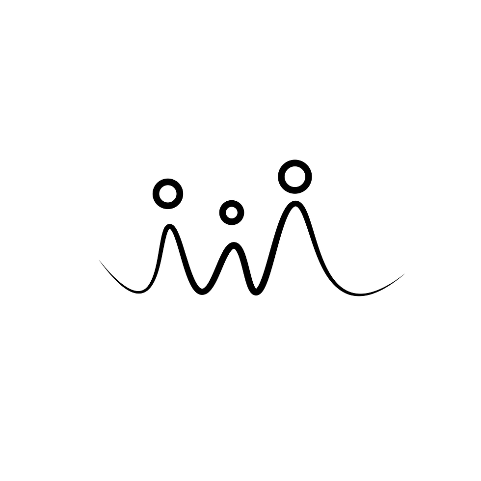
I wasn't just designing a logo, I wanted to build a visual language.
Now it was time to move onto designing. By this point, I had a much better idea of what styles to look into and work with. I started off by jumping into some sketching with pencil and pen, ideating, and experimenting with different forms and styles that might align with the vision. My goal here was to build a wide variety of examples of where we could go with the project. Something unique that I wanted to implement in this project was that I wanted to build a whole visual language within the brand. I wanted there to be elements that looked similar to the logo or that complemented the brand that could be used in a myriad of ways. So I was not just making logo variations, I was experimenting with different styles that expanded past one singular element or idea.


I started implementing the designs into digital versions using Adobe Illustrator to make vector forms. I utilized the programs ability to iterate quickly and generate multiple designs and variations to explore.


I matched the more complete ideas with the different mood boards that referenced the different user personas. This allowed us to see the visual representation of our audience in multiple ways.


I presented them to the team so that we could review. This process was more focused since we could directly refer back to the visual guidelines we had built earlier. After several rounds of Iterative review, we decided on a specific style.
This whole part of the process was one of my favorite parts because I could really build out the whole feel of this design look. I even made one of the design elements my phone screen so that I could be more immersed in the design and think about it more often.
When I have the space to let a design breathe, I find my best thinking happens away from the screen, in the background, unconsciously, until something clicks.


Once the logomark was locked, the rest of the system aligned naturally. Typography and color choices became clear when seen in context with the mark rather than evaluated in isolation.


This is another exciting part for everyone involved because of the mockups. Everyone gets to see the work in a much more presentable way and see how the logo, typography and colors all look like when they are used the right way. By choosing mockups that are scaled up really big, scaled down really small, and everything in between, print media, just the logo with photography, just typography and color, I was able to explore the limits of these elements and see how far I could push it before it didn't feel like the brand.
These types of tests are important to me because I can see how malleable the brand really is. This is especially important when not working as an in house designer. Knowing that these designs will be used by others without me, I was focused on setting them up for success. I didn't want the brand to be too fragile in the sense that it can only be used a certain way.
I then compiled all of the design work together to start and build the brand guidelines and identity deck to present the final work.


With the final design deck finished I was able to make one final presentation to the team. During this presentation I took the time to remind everyone how we got here by presenting the brand guidelines we finalized earlier, grounding the final reveal in the strategy we had built together from the start. Then I moved to the polished designs, presenting the typography, colors, logo in different combinations, the suggested photography style, and other additional visual elements that would compliment the brand.
Wrapping up with a variety of polished mockups for the team to see their brand in action. I was very grateful for the positive reaction of the team and it is always gratifying to see the clients pleased with the work. They were excited about what I had created and were especially invested because they could see where their feedback resulted in the final work, helping them see that this was not just a product of my making, but a productive collaboration.
Special thanks to the whole team at The Regenescape for building this with me. Projects like this are exactly the kind of work I want to keep doing, where design strategy, research, and craft come together in service of a mission worth building.
More Design Work
Here are some more projects I have been working on


Lina roesser tattoo
Website Design

artmill
website design

OXYGEN FOR TEAMS
BRANDING & WEBSITE DESIGN

Abstract Coffee
Branding

Leaf & Lark
branding
